
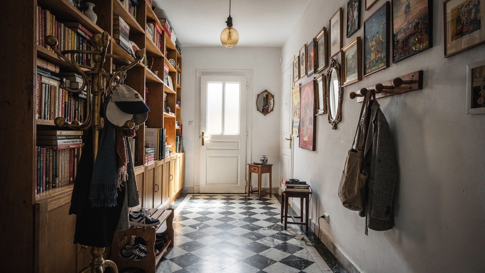
Checkerboard Floors: How to Use Them Without Looking Like a Pub
Colour combinations, tile sizes, materials and grout decisions that separate a designed checkerboard floor from a dated one — the UK guide.
Checkerboard floors are having a genuine moment in UK interiors. They are appearing in kitchens, bathrooms, hallways and utility rooms in a range of colour combinations that have very little in common with the black-and-white pub floors most people picture when they hear the phrase. The reason they keep going wrong is not the pattern itself. It is three specific decisions made badly: the wrong colour combination for the room, tiles that are too small for the space, and grout that fights rather than integrates with the pattern. Get those three things right and checkerboard is one of the most versatile, characterful floor choices available.
The Colour Combinations
The most significant development in UK checkerboard floors is the move away from black and white entirely. Colour combinations are now the primary design decision — and the range available creates floors that look nothing like one another despite sharing the same underlying pattern.
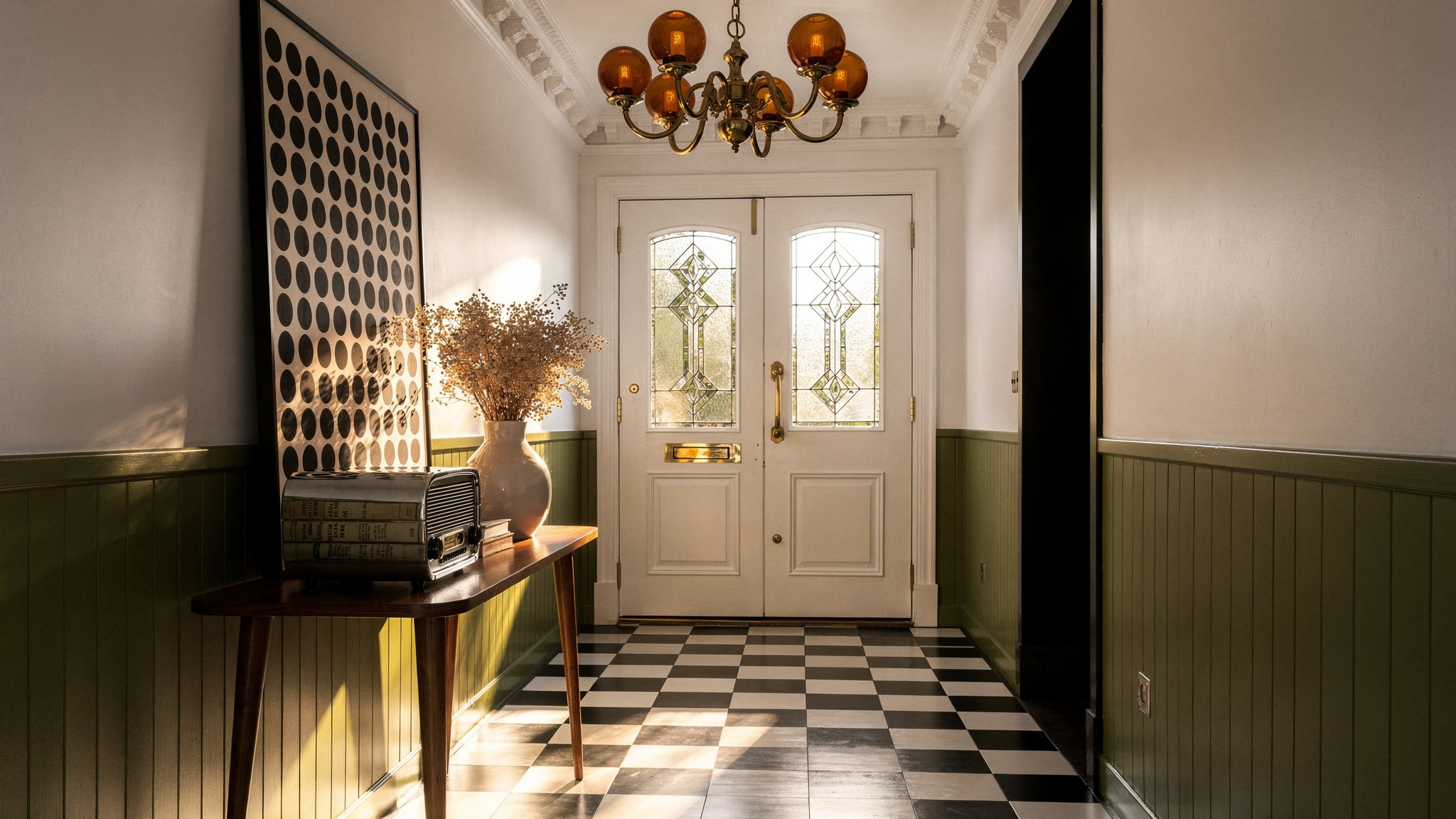
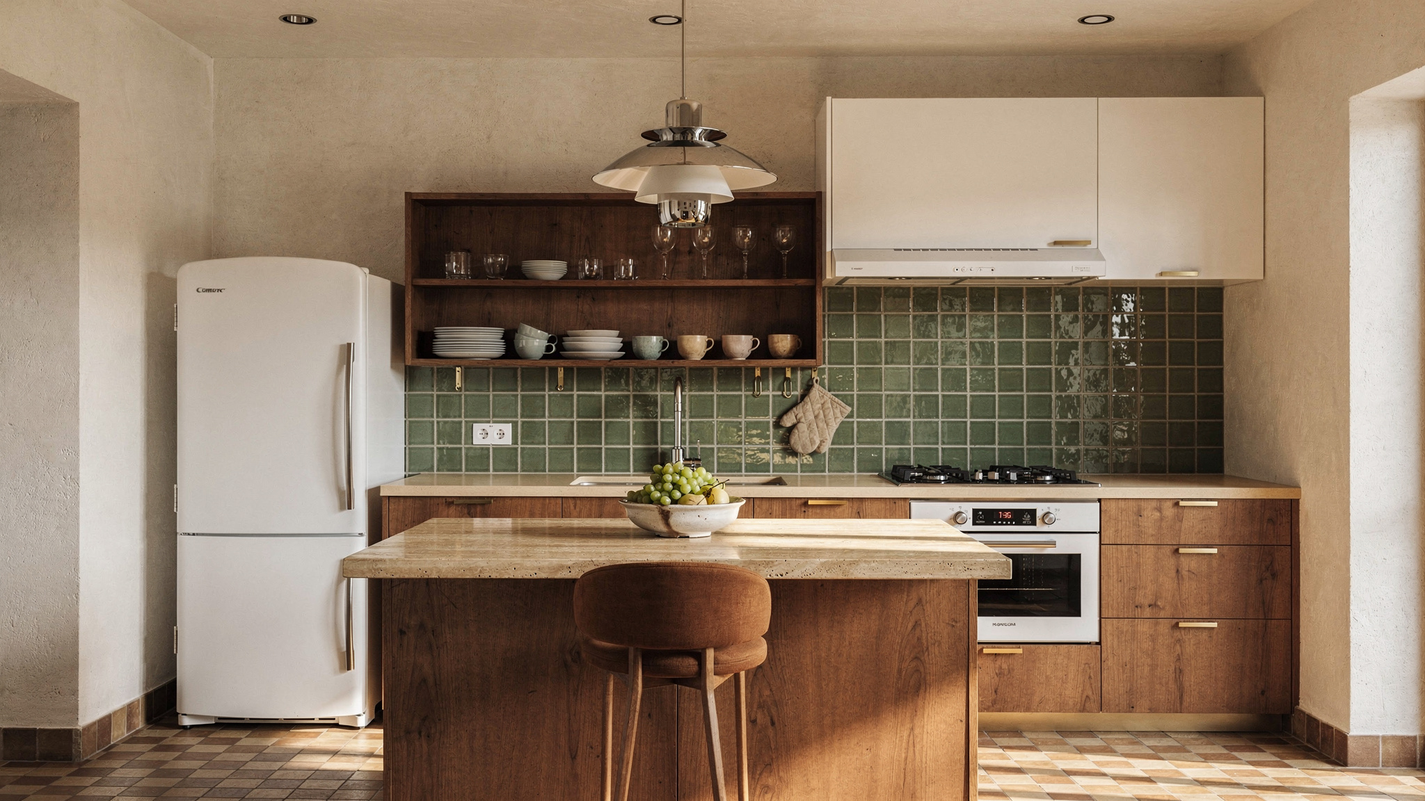
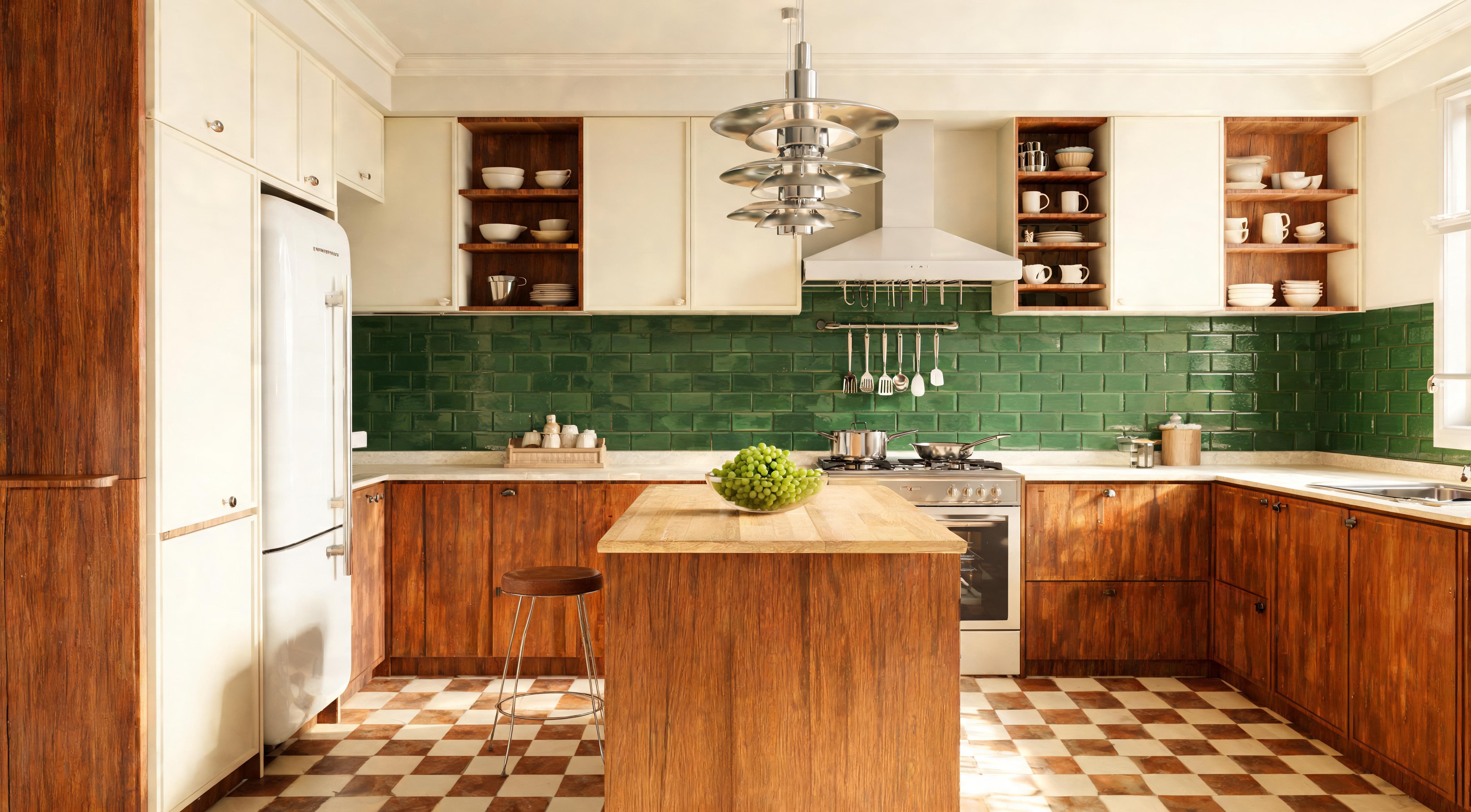
Terracotta and cream brings warmth that most UK kitchens — white walls, white units — badly need at floor level. Cream rather than brilliant white keeps the lighter tile from reading cold under artificial light. Sage and stone is the combination that reads least like a checkerboard from a distance — the low contrast between the two tones creates a subtle, woven visual effect that suits bathrooms and kitchens with natural material surfaces. Forest green and chalk delivers high contrast with depth rather than harshness; green carries warmth and draws in surrounding materials rather than competing with them, which is why it works so well in hallways. Classic black and white remains valid, but carries the most risk — it works best at large format in rooms with high ceilings and strong architectural character.
Where It Works — and Where It Does Not
Checkerboard suits transitional and functional rooms more naturally than spaces where the floor is the primary visual field during extended time in the room. The graphic quality of the pattern does its best work in rooms you move through or visit briefly.
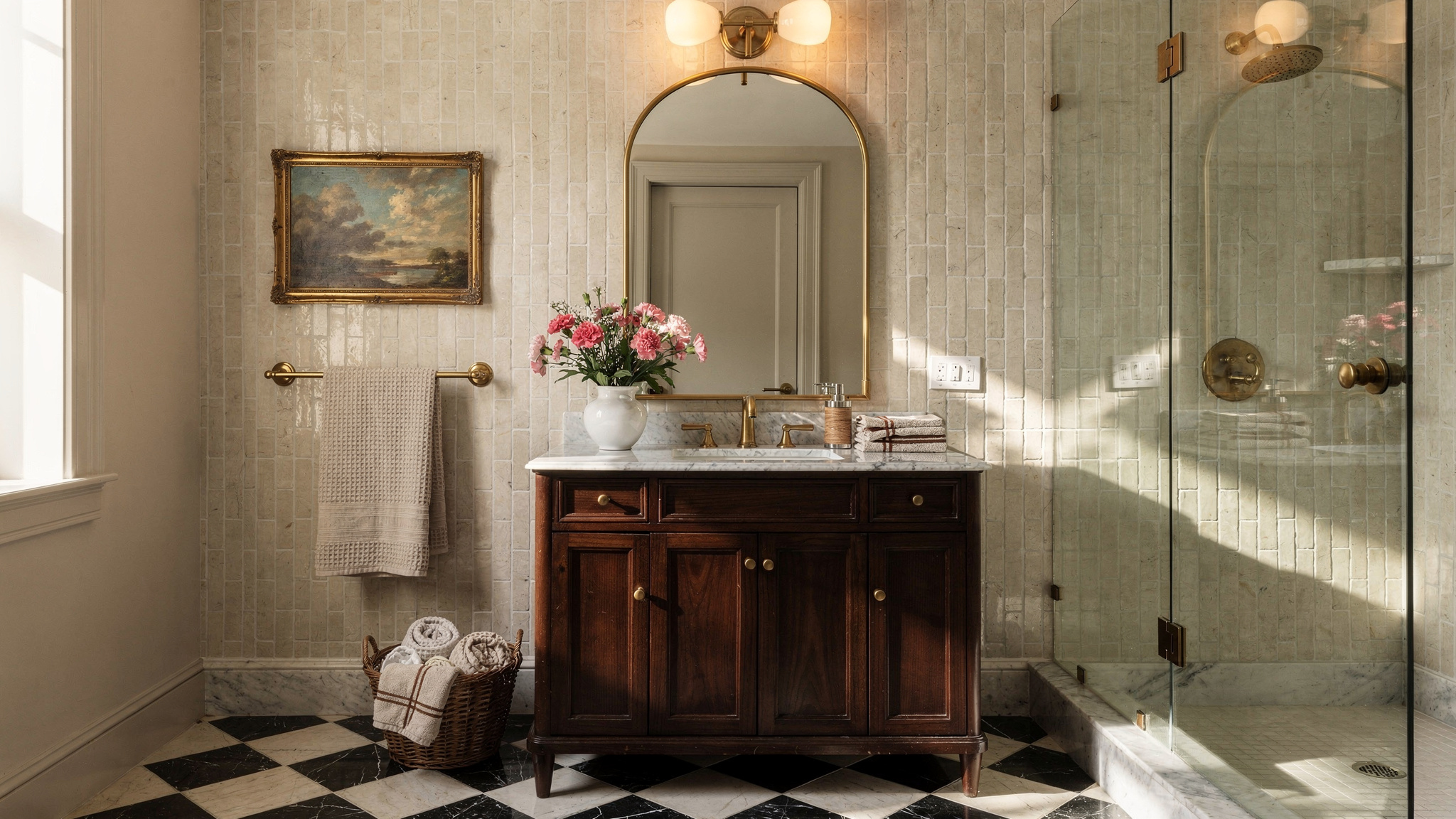
Hallways are the strongest application. The entrance to a home is the right place for a design statement, and checkerboard delivers one without requiring anything else in the room to work particularly hard. A terracotta and cream or forest green and chalk floor in a hallway makes the space feel like a room rather than a corridor.
Kitchens work particularly well — especially galley kitchens and kitchen-diners where the floor runs under units and into the dining area. Terracotta and cream or sage and stone are the safest combinations here. Bathrooms and cloakrooms benefit significantly: the smaller the room, the more intentional a patterned floor reads. A tiny cloakroom with a checkerboard floor feels designed. The same space with plain tiles feels unfinished. Utility rooms are the least precious application and the right place to take risks with bolder combinations.
Living rooms require more care — the pattern competes with textiles and furniture in a way it does not in functional rooms. Bedrooms are almost never the right choice. The graphic quality does not suit a room where the floor should be subordinate to everything else.
Tile Size: The Decision Most People Underestimate
Tile size changes the character of a checkerboard floor more dramatically than the colour combination — and it is the decision most frequently underestimated. The same terracotta and cream combination at 15cm reads entirely differently to the same combination at 40cm.
The reason small-format tiles read as dated in larger rooms is proportion: the eye processes a 15cm tile as domestic and functional rather than as a design decision. A 40cm tile in the same pattern reads as architectural. The tile size tells the room whether the floor is meant to be noticed.
Materials
Encaustic cement tiles are the most beautiful option — hand-made, slightly uneven, with a matte surface that improves with age and use. They require sealing in wet areas and are not the most practical in terms of maintenance, but they reward being in the room in a way that porcelain does not. Worth the cost in hallways and kitchens where the floor is experienced close-up daily.
Porcelain is the practical choice. Durable, waterproof, and available in every colour and size — it can be made to look nearly identical to encaustic from a distance while being significantly more forgiving in use. The right choice for bathrooms, utility rooms, and any high-traffic application. Vinyl and LVT is the accessible option: a quality 40cm LVT checkerboard is indistinguishable from porcelain in most photographs, is DIY-friendly, and at £15–35 per square metre is the lowest-cost route to the look. The only practical limitation is resale perception in higher-value properties.
Grout: The Detail That Makes or Breaks It
Grout colour in a checkerboard floor is not a minor decision — it is one of the three major choices that determines how the pattern reads. Most people choose grout last, from a product page, without holding a sample next to both tiles. This is where most checkerboard floors go wrong.
The most common mistake is using white grout with a terracotta and cream combination. White grout against the cream tile is invisible, but the same white grout creates a visible grid around each terracotta square. The floor stops reading as a checkerboard and starts reading as terracotta squares floating on white. The pattern disappears.
The rule: grout should either match the lighter tile closely — which softens and integrates the pattern — or sit as a mid-tone between the two colours, which sharpens and clarifies the graphic. For terracotta and cream, a warm sand or buff grout reads as part of the cream tile and integrates beautifully. For forest green and chalk, an off-white or warm stone grout integrates into the chalk tile without creating a competing grid.
What to avoid: grout that contrasts with both tiles, which creates a separate grid that dominates the pattern and makes the floor feel smaller than it is.
The Pub Test
The checkerboard floors that read as dated share specific characteristics. Understanding them makes the decision at each step straightforward.
The graphic quality of a checkerboard floor is always the strongest element in a room. Everything above floor level either matches its confidence or deliberately steps back and lets it lead. The floors that look like pubs are almost always rooms where the floor is the only considered decision — everything else was left as default, and the pattern reads as an isolated gesture rather than as part of a complete room.
Order tile samples before ordering tiles. Hold both colours together in the actual room at different times of day — UK light in the morning is a different question to UK light in the evening. Add the grout sample once you have confirmed the tile combination. The floor you end up with will look exactly like the sample — which is only a problem if you discover too late that the combination does not work in your room.