
How to Mix Wood Tones Without Your Room Looking Like a Furniture Showroom
Why matching all your wood to the same shade looks worse than mixing, how to combine oak with walnut and pine confidently, and the undertone trick designers actually use.
There is a persistent belief that all the wood in a room should match. Same shade, same grain, same finish — as if the dining table, the sideboard, the shelving and the picture frames all need to look like they came from the same tree. This instinct feels safe. It is also the reason so many rooms look like furniture showroom displays: coordinated, lifeless, and oddly flat.
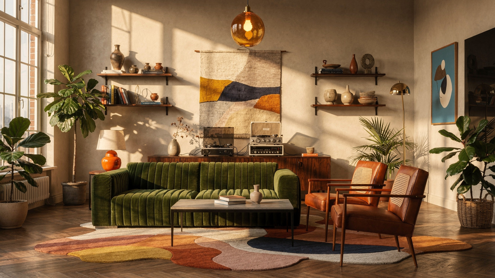
The truth is the opposite. Rooms that use a single wood tone throughout tend to look less designed, not more. They read as if everything was bought in one trip from one shop, which is exactly what happened, and it shows. A room with thoughtfully mixed wood tones — a dark walnut console against light oak shelving, a warm pine frame beside an ebony lamp base — looks layered, collected, and deliberately put together. The key word is “thoughtfully.” There is a difference between mixing well and mixing randomly, and it comes down to one concept that takes about two minutes to understand.
The undertone rule
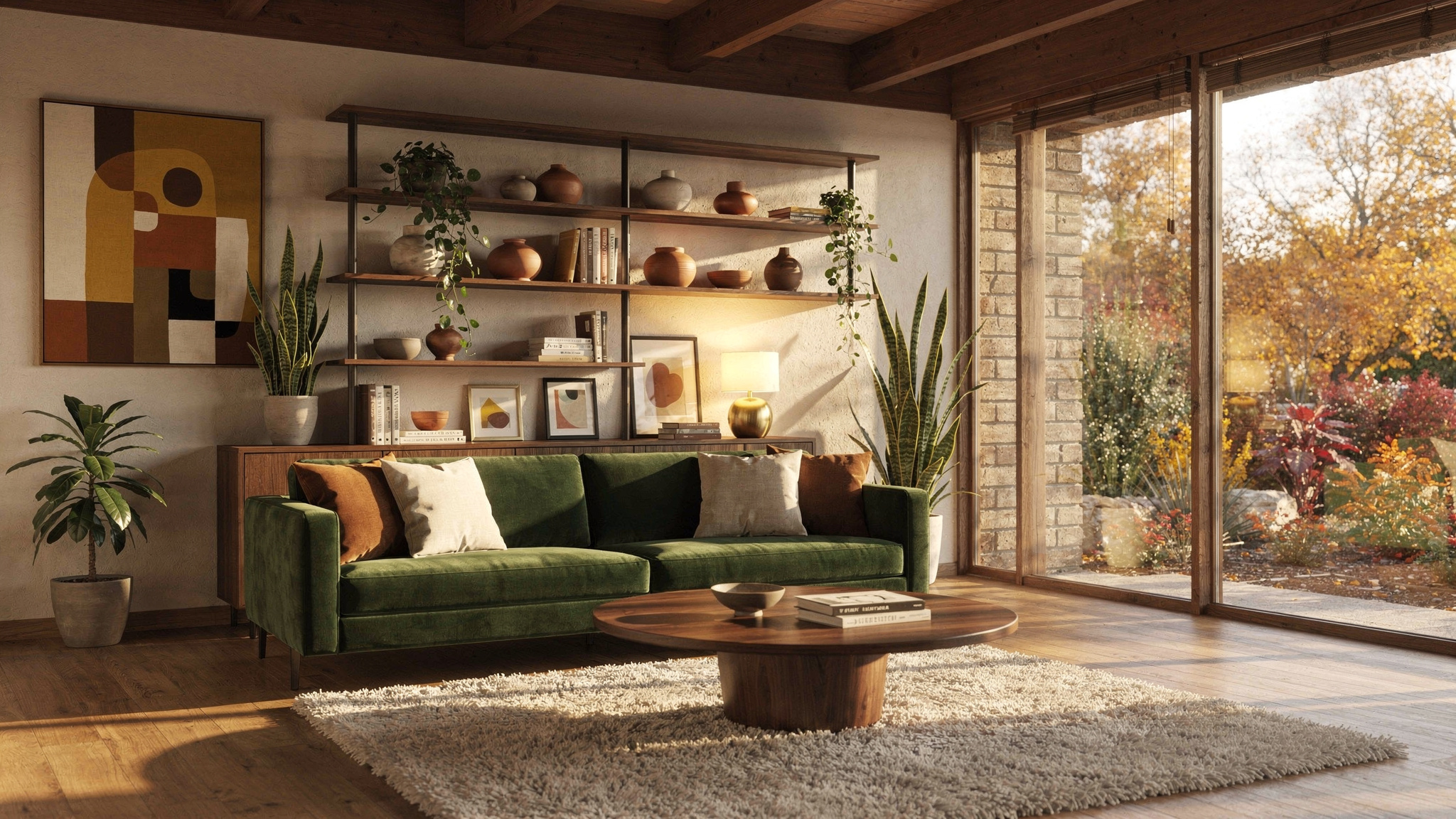
Every piece of wood, regardless of its darkness or lightness, has an undertone. This undertone is the colour that sits beneath the surface shade — the tint you notice when you look carefully at the grain or compare two pieces side by side. There are broadly three undertone families in wood used for furniture and flooring.
The rule is simple: you can mix any darkness levels you want — light with dark, pale with deep — as long as the undertones are in the same family or one of them is neutral. A light white oak shelf next to a dark walnut table works beautifully because both sit in the neutral family. A honey pine bookcase next to a grey-washed oak TV unit does not work because warm orange and cool grey fight each other.
This is the entire theory. Everything else is application.
Why matching looks worse than mixing
When every piece of wood in a room is the same shade, the eye has nothing to land on. There is no contrast, no layering, no visual hierarchy. The room reads as one undifferentiated mass of wood-coloured surfaces, and the brain interprets this as cheap — because in reality, the only way to achieve perfect wood matching is to buy everything from the same product line at the same retailer. Real homes accumulated over time never match perfectly, and that imperfection is what gives them character.
Designers call this “collected over time” — the effect of a room that looks like its contents were gathered gradually, chosen individually, and placed with intention rather than ordered from a catalogue page. This is the look most people are actually trying to achieve when they pin interiors photos, and it is impossible to create without mixing wood tones.
The practical consequence: stop trying to match. If you are furnishing a room and find yourself rejecting a piece you love because it does not match the existing wood, check the undertones instead. If they are compatible, the difference in shade is a feature, not a problem.
How to read the undertone of a piece you already own
This is easier than it sounds. Take the piece near a window in daylight — not direct sun, just even natural light — and look at the lightest part of the grain. The lightest streaks reveal the undertone more clearly than the overall surface colour.
If the lightest grain reads golden, amber, or honey — warm undertone. If it reads grey, silver, or ashy — cool undertone. If it reads tan, brown, or wheat with no obvious orange or grey pull — neutral.
You can also compare two pieces directly. Place a warm-toned piece next to a cool-toned piece and the clash will be immediately visible. The warm piece will look orange; the cool piece will look grey. Place two neutral-toned pieces of different darkness together and they will simply look like different shades of brown, which is exactly the effect you want.
The three-shade approach
If undertones are the rule, the three-shade approach is the method. In any room, aim for no more than three distinct wood tones. One dominant, one secondary, and one accent. This creates layering without chaos.
Dominant is the largest surface area of wood in the room — usually the floor, or the single biggest piece of furniture like a dining table or a bed frame. This sets the base tone that everything else relates to.
Secondary is the next most visible wood — a sideboard, a set of shelves, a desk. It should be a clearly different shade from the dominant, creating contrast. If the floor is light oak, the sideboard might be dark walnut. If the bed frame is dark, the bedside tables might be light.
Accent is the smallest presence — a picture frame, a tray on the coffee table, a wooden lamp base, a chopping board displayed on a kitchen shelf. The accent tone can be more adventurous because it occupies so little visual space. This is where you can introduce a slightly warmer or cooler tone without it overwhelming the room.
Three tones is a guideline, not a rigid limit. Four works if the room is large enough. Two works in a small room. The principle is that each tone should be visibly different from the others — not competing to be the same shade and failing, but openly, deliberately different.
The combinations that actually work
Certain pairings come up repeatedly in well-designed rooms, and they are worth knowing because they shortcut the theory into something immediately actionable.
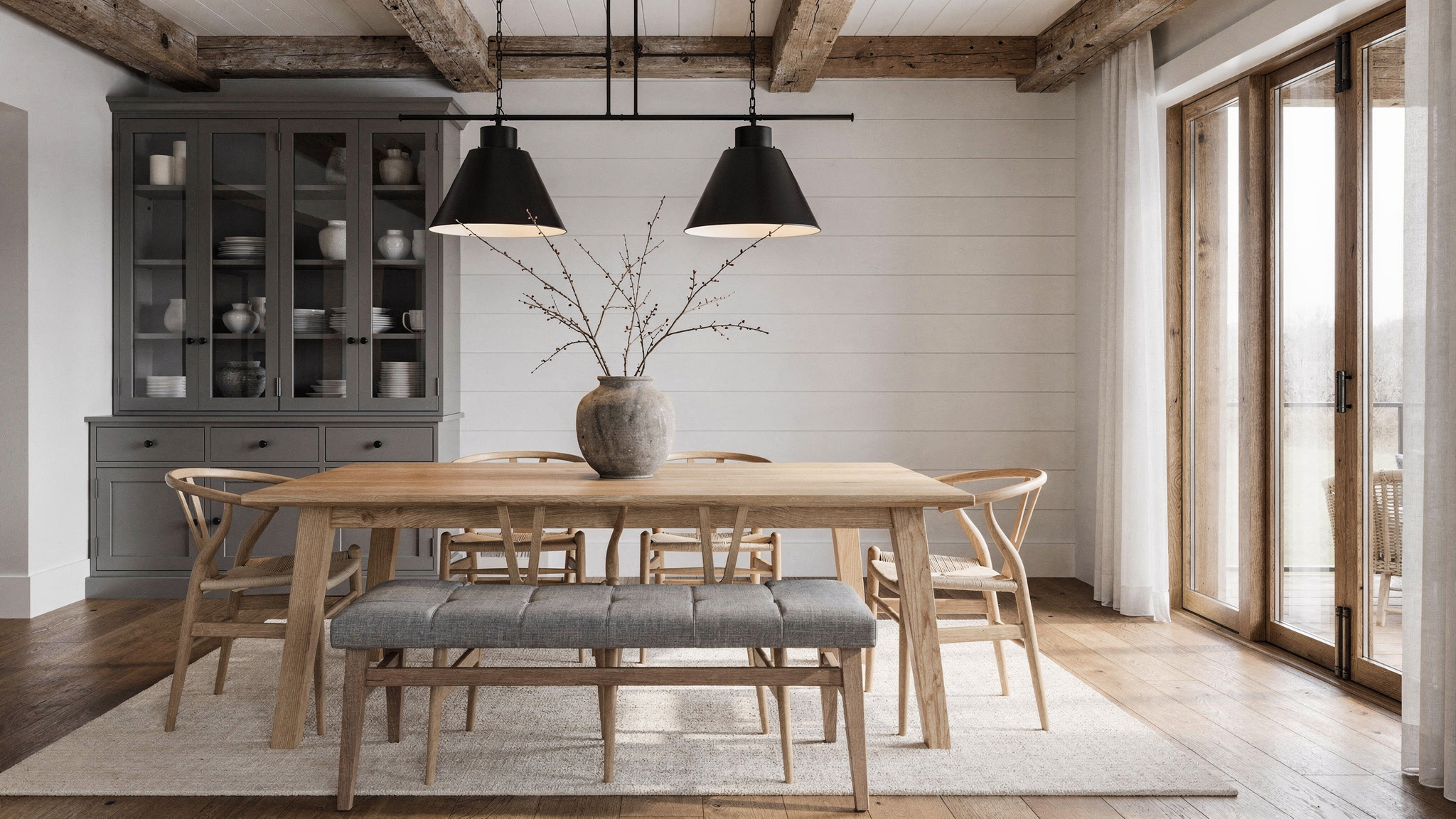
Light oak + dark walnut. The most reliable combination in European interiors. Both are neutral-undertoned, and the contrast between their shades creates depth without any colour clash. This is the pairing you see in Scandinavian-influenced rooms — a pale oak floor with a dark walnut sideboard, or oak shelving with walnut-framed artwork. It is nearly impossible to get wrong.
White oak + black-stained wood. A more graphic, contemporary combination. The near-white of pale oak against true black creates high contrast that reads as intentional and modern. Common in kitchens — white oak cabinets with black-stained open shelving, or a pale oak table with black-stained chairs. The black acts as a neutral that anchors the lighter wood.
Walnut + warm pine or teak. This works because walnut is neutral and pine or teak is warm — the neutral absorbs the warmth without clashing. The room will lean warm overall, which suits living rooms and bedrooms. Be careful with the proportion — too much warm pine without the walnut to ground it can read as a ski chalet.
Ash or beech + anything. Ash and beech are so neutral and light that they function almost like white — they pair with everything without competing. If you have a piece you are not sure how to integrate, placing it near ash or beech will almost always work.
The role of non-wood materials in bridging tones
When two wood tones in a room are not quite working — perhaps one is slightly warmer than you would like — the space between them matters. Placing a contrasting non-wood material between two wood pieces breaks the direct comparison and allows each tone to be read on its own terms.
Black metal is the most effective bridge. A black metal frame on a mirror hung above a walnut console separates the walnut visually from the oak shelving on the adjacent wall. The eye reads metal, then walnut, then metal, then oak — rather than walnut directly against oak. This is why so many contemporary furniture designs combine wood with black metal legs or frames: it is not just an aesthetic choice, it is a practical one that makes the wood easier to style.
White and cream surfaces work similarly. A white wall between a teak sideboard and a grey-washed oak bookcase prevents the warm and cool tones from sitting in direct visual competition. The more neutral space you place between competing undertones, the more forgiving the combination becomes.
Leather, stone, and concrete also act as bridges. A leather-topped stool between an oak table and a walnut shelf creates a material break that resets the eye. Natural stone on a surface between two wood pieces does the same. The principle is: if two wood tones are not quite harmonising, add distance or a non-wood material between them before assuming the combination is wrong.
The floor question
The floor is the largest wood surface in most rooms, and it anchors everything else. If you are choosing new flooring, pick a neutral-undertoned wood in a shade you can live with as the permanent base — the furniture will change over the years, but the floor will not.
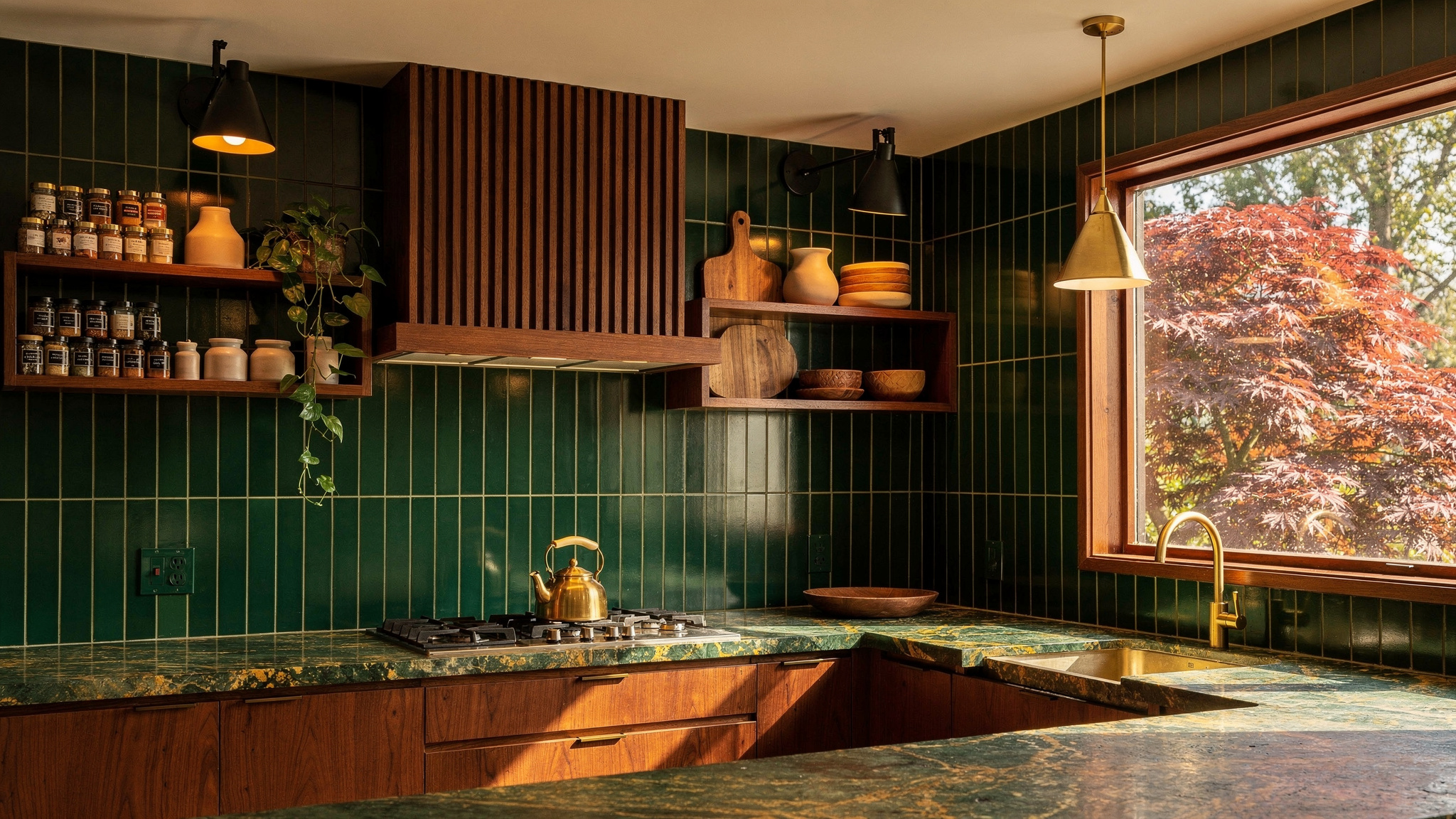
If you already have floors that pull warm (honey oak, amber-stained pine), you are not locked into warm furniture. You can successfully place a neutral walnut table on a warm oak floor because the undertone difference is subtle enough to work, and the darkness contrast provides the layering. What you want to avoid is placing cool-toned furniture — grey-washed pieces, driftwood finishes — on a warm floor, because the floor is too large a surface for the clash to go unnoticed.
The safest move if your floors are strongly warm-toned: stick to neutral-undertone furniture and let the floor be the only warm element. The neutrals will absorb the floor’s warmth without amplifying it, and the room will read as cohesive rather than orange.
Mixing wood tones is not about following a formula. It is about understanding one simple principle — check the undertone, not the shade — and then trusting your eye. If two pieces look wrong together, they almost certainly have clashing undertones. If they look right, they almost certainly share one. The rest is just varying the darkness for contrast and keeping the count to three tones or fewer. Your room should look like it was furnished over years by someone with taste, not ordered in one afternoon from a single catalogue. That requires mixing, not matching.